Poster 1: Complete
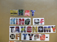
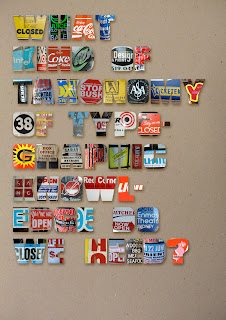
I found that the type becomes a little hard to read when it has the images in it on a white background (especially when printed). So after playing around with cutting out individual letters and placing it in front of card and photographing it, I've found that playing around with the letters in Photoshop gives a much tidier effect while keeping the colour of the images bright.
Therefore I like the second option for the poster better.


Therefore I like the second option for the poster better.


