Friday, 19 October 2007 by galina
This blog represents my workbook for this years research.
On your right is my DESIGN RESEARCH catalogue, next to which is a selection of my work for EYE (in-house design), and next to that my freelance work for Moda Fotografica.
In front of you is my taxonomy posters, and street stretch.
Comment are welcome.
(behind you is Chloe Geoghegan's diagram)
| »
Sunday, 14 October 2007 by galina
When going to the SemiPermanent design conference in April this year, we were given a book with lots of different designers, illustrators etc work.
I checked out their website to get tickets for next year and saw that I can submit up to 3 pieces of work for consideration to get into the book...
So i took a piece from DESI201, DESI301 and DESI401.
Fingers crossed I get in.


| »
Wednesday, 10 October 2007 by galina
For EYE in Singapore, who are launching new sites for Terminal 3 (Changi International Airport) opening in January 08.
T3 NewsMake sure you click on the passport and the 3 terminal pics to launch flash files.
| »
Wednesday, 3 October 2007 by galina
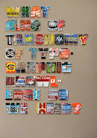
Poster 2: taxonomy on official, institutional, council, government placed signage and markings, is complete.
There seems to be only one other relevant category to taxonomize all my images into and that's the hand rendered marking, lettering, graffiti. The question I want to ask relates to this idea of what determines what is good or bad typography. Does hand drawn/rendered lettering not fit into a category that can be called typography (because typography suggest at a higher, refined alphabet) ?
I find the markings and images quite unique and some beautiful in their own right. The only main difference from other street type is that is not times, it does not last. It's very temporary.

| »
by galina
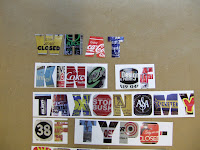
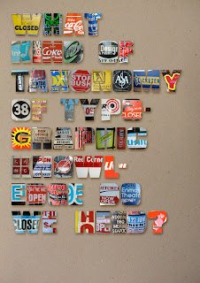
I found that the type becomes a little hard to read when it has the images in it on a white background (especially when printed). So after playing around with cutting out individual letters and placing it in front of card and photographing it, I've found that playing around with the letters in Photoshop gives a much tidier effect while keeping the colour of the images bright.
Therefore I like the second option for the poster better.


| »
by galina
Coming up with good questions into which to fit the different taxonomies.
1. WHAT KIND OF TAXONOMY OF TYPOGRAPHIC KNOWLEDGE TO WE NEED?
taxonomy of street typography: posters, shop signs, commercial type, advertising...
2. IS THERE A LAW TO ORGANIZING OFFICIAL, INSTITUTIONAL MARKING?
Maybe this question should read 'should there be a law to...' in reference to the way type is used guide and to enforce the law to the public.
taxonomy of cautionary, institutional, official marking placed by council/government etc: road signs, the 'look' on the ground, the stencil marking at the train station...
3. CAN ALL TYPE THAT IS HAND RENDERED BE CLASSIFIED AS VALID (or meaningful) TYPOGRAPHY?
taxonomy of graffiti, hand written signs, markings...
4. ?


| »
by galina
In the avarage submission space (3 portrait A1 cards wide) there isn't enough room for all my design pieces. It's too crouded, and there's not enough room for the street shots and computer with my 'workbook' blog.
Can i get a pic of my space and and measurements asap please??

| »
Sunday, 30 September 2007 by galina
I have finished stitching the images together, slight problem, the whole street length equals two and half times the length of the average submission space... It's only 10cm high, so I don't want to make it any smaller... ?
I have started to place the different taxonomies by colour along the street shot, lots more to go.


| »
