Sunday, 30 September 2007 by galina
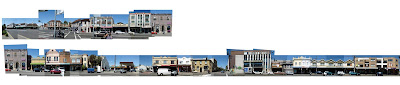
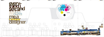
I have finished stitching the images together, slight problem, the whole street length equals two and half times the length of the average submission space... It's only 10cm high, so I don't want to make it any smaller... ?
I have started to place the different taxonomies by colour along the street shot, lots more to go.

| »
Tuesday, 25 September 2007 by galina
The aim of my taxonomy posters is to classify these images of street type and markings into colour and texture... ?
A valid classification?
I'm a little bit stuck as to the statements I'm going to use on these posters...
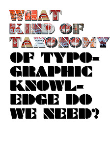
It's one thing to taxonomize information, eg. an ornithologist would taxonomize birds, which is useful for research and museums, but it would not tell us how birds fly. Therefore my taxonomy posters can show images of type and markings, ideas about noticing and observing, but does it have to be this greater thing other than just the ideas around taxonomy itself... ? What kind of taxonomy of typographic street language do we need? What is the purpose?
These are the 4 taxonomies and statements that I'm thinking of using:
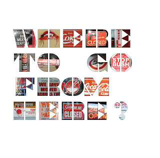
1: Taxonomy: Street typography only
"Design can be art. Design can be communication. Street typography can be communicational art."
2: Taxonomy: Red
"?"
3: Taxonomy: Yellow
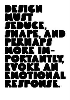
"Design must seduce, shape, and perhaps more importantly, evoke an emotional response." April Greiman
4: Taxonomy: Blue
"? "
These posters are not finished, obviously, because of the black letters that still need filling. I'm also not so pleased with the red statement. So need to rephrase/rethink it.

| »
by galina
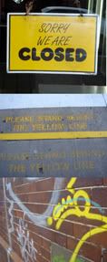
Poster 1: will be a collection of yellow street typography and markings. I want these to almost be a way of preserving elements of type, etc. in time.
Looking at ways to taxonomise my findings I came across a 'yellow things' exhibition of litter by Paul Baumann and 'big yellow', a collection of yellow street signage by Rosalie Gascoige:
Paul Baumann: Rosalie Gascoigne:
| »
by galina
In order to show in my posters:
1. taxonomy
2. evidence of research
3. how they link
4. and how different parts of design link with different taxonimies, etc...
I have chosen to present in this way:
 Poster #3:
 I have started developing a diagram that sorts all the different taxonomies of the process I have gone through in order to 'taxonomize' and create.
Understand > Apply > Analyze > Evaluate > Create...
(not sure if this is the final order or most appropriate words for now, but will go with it)
Street shot panoramic at the bottom with work like a footnote of taxonomies, including the little snap shots above. Obviously still not finished putting this together, but I have mocked up how it should look. Possibly smaller.
| »
Saturday, 22 September 2007 by galina
Some layout sketches for the catalogue. Also some cover options.


| »
Thursday, 20 September 2007 by galina
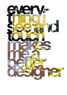
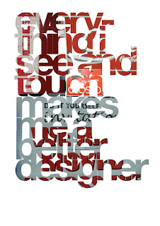
I think I'm finally getting these posters resolved. I have to work on my text, something that better reflects each taxonomy and my verdicts about design from my 3 categories of design this year (student, in-house, freelance). Probably also try what i did in the previous poster idea and place an image that fits into that particular taxonomy into each character of the text that i come up with.
| »
Tuesday, 18 September 2007 by galina
Trying something a little different. Rather than have square shots of images that I have sorted into different taxonomies, which looks rather boring, layout wise, I've placed them inside the type.
Something to try next, rather placing the images with in a the characters of a question or sentence, possibly put together an alphabet? And do one for each poster. ie. 5 posters, 5 taxonomies, 5 different bold character sets.
| »
Monday, 17 September 2007 by galina
Two double page spreads from my design catalogue:
Will we notice if it's here one day... and gone the next?
Asking a good question about my findings this year.


| »
by galina
Student design work:I will be submitting an A5 50 page catalogue of my research, thoughts and ideas from this years findings. It will include my Essay and design work examples.
I am also working on 5 posters and panoramic street shot, both of which look at ideas behind taxonomy and different ways of looking and collecting visual information.
workbook:My workbook this year has been my blog. So I will be setting up a computer in my submission space with this blog open.
My A5 catalogue will also be like a 'designed' workbook as my writing is really transparent about my ideas and thoughts on the 3 parts of my design this year.
Student. In-house. Freelance.
| »
by galina
In-house design work: I will be submitting a collection of my work from EYE while working as an in-house designer. Since the briefing system has also been quite an important part of me working in-house I will also be submitting the briefing forms. All of this in A4 book format. Simple. I've also redesigned the company Mook (Magazine + Book) which is a company profile. So I will be submitting that also.
Again my thoughts and ideas and links between this part of my work and freelance and student will be in my student work submission.
| »
by galina
Freelance Design Work:I will be submitting a mini folio of the freelance design work that I did for Moda Fotografica gallery this year.
The workings and my thoughts and ideas about freelance design vs student/in-house work will be part of student work submission.

| »
Sunday, 9 September 2007 by galina
As part of our submission requirements for DESI401, we are to write a 3000-5000 words essay on our research and design. I've chosen to submit mine in the form of an A5 sized catalogue. My catalogue is going to be an important part of my (design research) years work, it will look closely into my discoveries of design this year, as well as show my design work and critiques.
This blog will constitute my 'workbook'. I've thought about a way of submitting it, but it was never really intended to be printed... so submitted as an online blog it will be. (with some layout adjustments)
Below is the first 1200 words of my design essay. Only a quarter of the way along, but have a lot of notes and sketches still to process and put into my essay. It seems most straight forward to submit it in the 3 sections that I've been look at this year. Student, In-house and Freelance design sections.


| »
by galina

Above is the panoramic street shot (it is still only one third of the street I'm intending to include). Starting to add some of the close up shots at the top.
I've decided to use this 'edgy'/paste-it-together approach since looking at the latest IdN magazine. There was a double page spread of a photo collage, and I really liked that effect.
| »
Thursday, 6 September 2007 by galina
From the feature bellow from the latest IdN magazine:
The main difference between montage and collage — though the two are often difficult to separate — is that the subject matter of the elements chosen for the former is of primary importance, whereas the materials used in collage tend to be selected purely for their aesthetic effect.
This is very relevant to the type of design work that I'm putting together now... and at this stage I can't limit my approach simply to montage or collage... maybe when I'm closer to the finish I will be able to choose one or the other.
So far, using my ideas about taxonomy, I guess my work is more collage styled.


| »