<body><script type="text/javascript"> function setAttributeOnload(object, attribute, val) { if(window.addEventListener) { window.addEventListener('load', function(){ object[attribute] = val; }, false); } else { window.attachEvent('onload', function(){ object[attribute] = val; }); } } </script> <div id="navbar-iframe-container"></div> <script type="text/javascript" src="https://apis.google.com/js/platform.js"></script> <script type="text/javascript"> gapi.load("gapi.iframes:gapi.iframes.style.bubble", function() { if (gapi.iframes && gapi.iframes.getContext) { gapi.iframes.getContext().openChild({ url: 'https://www.blogger.com/navbar/5424045260746825874?origin\x3dhttp://missgalina.blogspot.com', where: document.getElementById("navbar-iframe-container"), id: "navbar-iframe" }); } }); </script>

Semi-Permanent Sydney 2007

Saturday, 31 March 2007 by galina


On Friday 30 March, i was lucky enough to have work pay for a day at Semi-Permanent!

Semi-Permanent is an annual design festival hosted by 'Design is Kinky'. It consists of a conference and exhibitions. Semi-Permanent inserts a flood of inspiration into the Australian design community bringing you face to face with world renowned artists and designers.

It was fantastic, and I have some notes I'm going to post here about some of the speakers on Monday, when i have access to internt again. Over all it was a great day, 6 speakers, not just graphic designers spoke, but illustrators, animators, typographers, painters...

The friday line up when something like this:

Sophie Howarth /Photography
TOKO /Graphic Design
Si Scott /Typography/Graphic Design
Tiffany Bozic /Painting/Illustration
James Jean /Illustration/Painting
Motion Theory /Music Videos/Film/Animation

TOKO were the best interms of presenting style and type of work. They were a young couple from Holland. Very funny!
Some quick notes I jotted down:
Dutch design (or even painting from way back: Mondrian) ... = Grids
Grids = actually means ANYTHING GOES!
Because structure needs humour.
"Holland actually looks like Sydney... if you close your eyes!"

The difference between coffee
In Holland you just ask for coffee and you get it.
In Australia, you need to identify:
1. Length (tall of short)
2. Colour (black or white)
3. Angle (flat or not)

"sometimes there's no time to think, just produce work."

creating you own typeface for a project, makes the artwork your own.

Het Zuidelijk Toneel is a Holland Theatregroup, they asked TOKO to come up with a "no-style" identity. ... they didn't know what they wanted! Something, basic, simple and straight forward. So TOKO didn't design a logo. Play titles and the name of the theatergroup are equally important and in print often overprinted.

the top 3 letters are always cut off, they are used effectively, "don't waste type!"


Si Scott:
Man, this guy couldn't speak to save himself! His work was absolutely amazing, and it’s incredible that he did it all by hand, but I think he had never spoken to so many people about his work before. Poor fellow was so nervous!



Tiffany Bozic:
"a riddle for the beginning of love
'good intensions'
a metaphor for the end of love"

"rules don't apply to my brushes", "guess-timating"


James Jean:
A composition should contain both a PUSH and PULL, between SMOOTHE and ROUGH = THUNDER and WIND

My Visual Tunnel

Friday, 30 March 2007 by galina

On Tuesday 27 March I tried to depict my journey through photographing my visual path from home to work. The interesting thing that I was wanting to find out was how much advertising comes into my line of sight on my daily trip to work.


Map of Sydney's Inner West suburbs from Google Maps showing my trip.


Same Sydney Map but in Satellite view.

My journey starts at
7.25am walk out of the door of my apartment (Marlborough Road)
7.37am catch the train from Flemington Station to Town Hall/QVB
8.12am catch the 443 bus from QVB (York Street) to Pyrmont (Harris Street)
8.25am walk to EYE (Harris Street to Saunders Street)

AND all the photos I took that day are coming hopefully in a slide show thing. (I'm working on it)

So check this space in a couple of days when i get access to internet again.

Fabien Girardin: Tracing the Visitor’s Eye

Tuesday, 27 March 2007 by galina


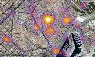
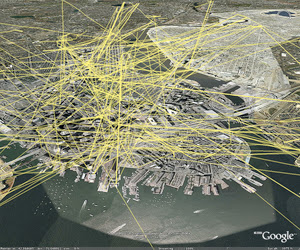
I found this really amazing guy Fabien Girardin. He shows the “traces” left by Flickr tourists and citizens as they transit Barcelona based on around 4000 images taken between October and December of 2006. A trace consists of an ordered set of geotagged images taken by one person in one day. The data and visualizations is a bit hard to follow, but there’s potential for patterns of how tourists navigate the urban space. He also found that the maps do not gage a sense of time, but they do highlight when and where the traces start and end.

These heatmaps directed my research to another level, and started my thinking about (consumer) line-of sight/target advertising.
There’s an article about how advertisers are now looking to use what they would consider "unsold" space to place their messages. This phenomenon even has a name, urban spam. But why just post the same ad for everyone to see? Why not use an individual viewer’s line of sight as they travel as a "channel" into which to project ads and messages where blank space exists?
Where Girardin’s heat maps showed the locations of single images, the traces follow the path the photographer takes through the city/their visual corridor.
(Cities as Billboards)

Aram Bartholl

Friday, 23 March 2007 by galina


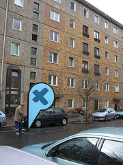
While researching aesthetics and cities I came across this guy. Bartholl studied architecture at the University of Arts in Berlin. He currently works on concepts about data spaces and locative media. In his space/media art projects he addresses the embodiment of digital characteristic traits in the physical space.
I found his project ‘Maps’ rather interesting. It questions the red markers of the location based search engine Google Maps. The sculpture he created here had a huge visual impact on the surrounding environment, especially when viewed in real life. The photo of the Plazes Pin on the left doesn't do it justice, looks fake. I like the idea of putting the virtual into the real.

by Terrence Rosenberg">RESPONSE to "The Reservoir": Towards a Poetic Model of Research in Design by Terrence Rosenberg

Tuesday, 13 March 2007 by galina

http://www.herts.ac.uk/artdes1/research/papers/wpades/vol1/rosenberg2.html
(Above is where the reading can be found, it also has the Figures that the reading talks about, which is a little bit helpful, as this started to annoy me as the printout reading that I had has no diagrams.)

The part that talks about "the hunch" I found very interesting, and it finally made sense when all those times in critiques, especially in 2nd year, when we were trying to explain why we designed some things one way or another, and couldn't, and all we could say was "because I like it" and got the evil glare or "give me a real reason" from Luke or Aaron... It all sort of makes sense now.

When Alex Seago writes: "... the process of discovery in much successful research work is, in reality, a combination of rigorous methodology and the following up of intuitive "hunches". (Seago 1994, p.5.)

ok, now I’m not saying that we had rigorous methodology behind our projects in 2nd year, BUT "the hunches" under which we (or at least I) made some of my aesthetic decisions makes sense. Although I think here, he is also talking about hunches in research topics/avenues.

“The ‘hunch’ is so slim that it is not possible to develop techniques and dynamics or indeed a methodology for it.”

“… in this position it is all “hunch”, the imagination is unfettered by criticism, unforced and involuted – exclusively and only valuable as a ‘private enthusiasm’. The “hunch” expands inordinately but only in relation to the individual.”

now the part about Ptolemaic, homocentric conception, neo-Dionysian, Apollonian etc, had me all confused, and by the end of the second page I had lost track of what he was talking about, and started to fall asleep (could have also been the fact it was 7.30am, and I was on the train to work, and the sun was shining in my eye while tge guy in the seat next to me, with his two-sizes-too-small-suite was too close for my liking...) Anyway... I had to wait until I could look all of those words up, which I have, and tagged them on to the end of this post.

now, back to the reading: Ground and Open Water
Loved this section. Being a creative person, it helps when complex stuff is visually described, diagrammatised. So, the pull to originality (ground) versus the space of originality which has not yet been established (open water) are the two forces that make up “the hunch”.

I also found the following very interesting: “Research in open water may be imagined as swimming and diving. In open water the swimmer or diver is immersed and at the mercy of the element, water, whereas, on land, the element lies outside the person digging or building and is very much controlled by them.”

My Research will need to start on the ground, but hopefully can move to open water…

Conventional research = Centripetal.
Conventional research comes up with a question and develops a research strategy in advance of the process. The research channel is clear, focussed and predetermined. (I often find myself coming up with a solution when faced with a design problem without going through the whole process, I work backwards. BUT, I think successful research benefits from a less limiting process.) It is true, that simple and clear idea progresses to a simple and clear outcome.

‘Poetic’ research develops from an interactive space between substantiation and deviation. Background and foreground. Poetic enquiry evolves from both fields, and not predetermined. (established in open water)

Another good analogy along the same line of thinking is: “Water signifies liquidity in thought and ground a site of determined thinking. The Reservoir is used notionally to plot a creative search (a finding!)” I have always been a determined thinker in my research in the past, very much both feet on the grounds. I will aim in the years research to steer towards the water.

The Three Triggers is something I am already familiar with from previous years students, although the idea of weaving together the three unrelated triggers is new to me, and is something I would like to try.


Paradigms: pattern or model
Apollonian: characterized by clarity, harmony and restraint. In the philosophy of Friedrick Nietzsche, of or embodying the power of critical reason as opposed to the creative-intuitive.
Postulates: to assume or assert the truth, reality, or necessity of, especially as a basis of an argument.
Dionysian: in the philosophy of Nietzsche, of or displaying creative-intuitive power as opposed to critical-rational power.
Homocentric: diverging from or converging to the same point.
Centripetal: directed toward the centre, operating by centripetal force.
Centrifugal: moving or directed outward from the centre.
Syntagm: a syntactic string of words that form a part of some larger syntactic unit. (syntagma: sequence of words in a relationship to one another.
(from dictionary.com)

Outdoor Advertising

Thursday, 8 March 2007 by galina


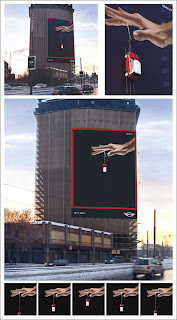
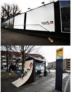
Billboard for MINI somewhere in Italy, where a fiberglass mini is attached to a moving ramp to create a Yo-Yo effect.


Nintendo DS Wrap somewhere in Japan.


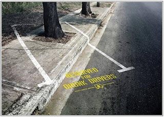
outdoor advertising that thinks outside the square: takes on a more practical approach.


another add with a practical approach! Very Interactive.

Cleaver Packaging

Wednesday, 7 March 2007 by galina


Research Outline: Draft 1

Monday, 5 March 2007 by galina

Title of study
one sentence in which key research theme is identified and succinctly conveyed

1) Outdoor advertising vs. architecture.
2) 'The Briefing Process'
(I still need to develop these themes as they are not succinctly conveyed.)


what are you researching and with what end in mind
describe more generally the area of inquiry, and propose possible outputs/results

At this early stage of research, there are two avenues that I would like to look into.
1) How outdoor advertising affects architecture and landscapes, how the two work together, and intern how that advertising/architecture affects the way we feel. I’m going to look into the aesthetics of cities, urban planning, and sociology.
2) “The Briefing Process” that I am directly involved in at EYE. I will look at internal structures of briefs, projects, marketing output, the process from DESIGN PROBLEM to IDEA to CREATIVE OUTCOME, the people a project goes through, what influence they have on the final outcome, how Branding ties into it, the network and marketing in different markets (Australia & NZ with North America, Asia and Europe).


how will you conduct your research
methodology and schedule, 'what' you plan to do and 'when'

I plan to expand my current knowledge of both topics by continuing to read relevant material, looking online as well as library books. I aim to have the most relevant information put on this blog, so you can see what I am finding and what information is feeding into my research development. My aim is to come up with five pieces of information that will help and assist in my research a week (one a day). Whether it is visual or written for the next 5 weeks. This is to widen my level of enquiry and build a strong foundation for my research. I will also start drawing up ideas of final outcomes.


why is this research worth doing
frame the research within an existing body of knowledge and within your immediate
environment... how might what you're doing contribute?

1) It will give the company I work for a greater understanding of the environment they work it. What affect they inventory is having on the ‘beauty of Sydney’ for example. Raise awareness of the effects of outdoor advertising on our immediate environment (whether the positive outweighs the negative, etc).
2) It will hopefully be able to create visible structure. It would also be able to show WHY our work looks the way it does, HOW different it would look if the current input balance was skewed, and propose EYE through the eyes of “Galina as Brand Manager” for example, not exactly sure where to take this one yet.


what will you produce?
describe more generally the form you see outcomes/results taking

1) Billboard. Series of scrolling adds. A visual diary/photographic publication of Sydney vs. outdoor advertising. A series of large scaled mockups of ‘what ifs’ eg. Advertising took over the city, our homes… a proposal for 2027.
2) A series of corporate documents outlining my findings. A book. A banner add.


selected preliminary list of readings and references
can be artefacts based as much as texts etc...

At this stage there is this book I have on order from Amazon:
Alain Du Botton “The Architecture of Happiness”

Welcome

Thursday, 1 March 2007 by galina

Hi There!
This blog will soon be filled with ideas, thought processes, and reviews of graphic design.
This year I am undertaking a research assignment as part of my fourth year in a Bachelor of Fine Arts in Graphic Design at the University of Canterbury.
I am based in Sydney, and working at a company called EYE (www.eyecorp.com) as a junior graphic designer.
My online research through design journey begins here...

about

October 2006: I moved to Sydney from Christchurch, NZ. February 2007: I started working at EYE, an outdoor media advertising company. I work in the Marketing department, as a Graphic Designer (one of 4 in-house designers) producing and co-ordinating work that promotes EYE as a multi-format, single branded, out-of-home entity world wide. February 2004-currently I am a full time student at Canterbury University. This year I am undertaking a research assignment for DESI401 (my fourth year of a B.FA Degree in Graphic Design) and this blog is here as a means of communication with my lecturer Luke Wood and other design students.

search

recent posts

recent comments

archives

links

taxonomy